Pressed Down Image Card Block Button
Featured

Description
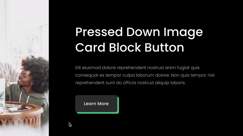
Add a pressed down effect to the image card block’s button – along with a solid drop shadow style. This plugin uses css editor and works with all Squarespace versions.
How To Install
Enable the button via image card block settings.
Once the header button has been added and saved, go to the Custom CSS Editor. Copy and paste the code below into the Custom CSS Editor box.
// Pressed Down Image Card Block Button //

.sqs-block-image .design-layout-card .image-button a {
  box-shadow: 6px 6px #4FBF87;
  transition: all ease-in .05s;
}

.sqs-block-image .design-layout-card .image-button a:active {
  box-shadow: none;
  transform: translateY(4px) !important;
  transition: all ease-in .05s;
}
Customize
Adjust the box shadow color to your liking for both the desktop header button and the mobile menu button.
You do not need to change the transform or transition values. This helps create the effect of the button being pushed down.
Be sure to keep :active at the end of each last code.
Featured
